Carto, Political Boundaries, SQL, and Guns and Coffee
Using Carto and SQL Joins to make a choropleth of Starbucks and gunshops by zip code
Data to download
Just copy-and-paste the following URLs (from this subset of data) and import into your Carto Dataset maker:
- https://dannguyen.github.io/sql-carto-journalism-exercises/data/shapefiles/congress_districts_114th.zip
- https://dannguyen.github.io/sql-carto-journalism-exercises/data/shapefiles/us_county_shapes.zip
- https://dannguyen.github.io/sql-carto-journalism-exercises/data/shapefiles/zcta_simplified.zip
- https://dannguyen.github.io/sql-carto-journalism-exercises/data/wrangled/congressmembers.csv
- https://dannguyen.github.io/sql-carto-journalism-exercises/data/wrangled/starbucks_locations.csv
Map the Congressional house districts
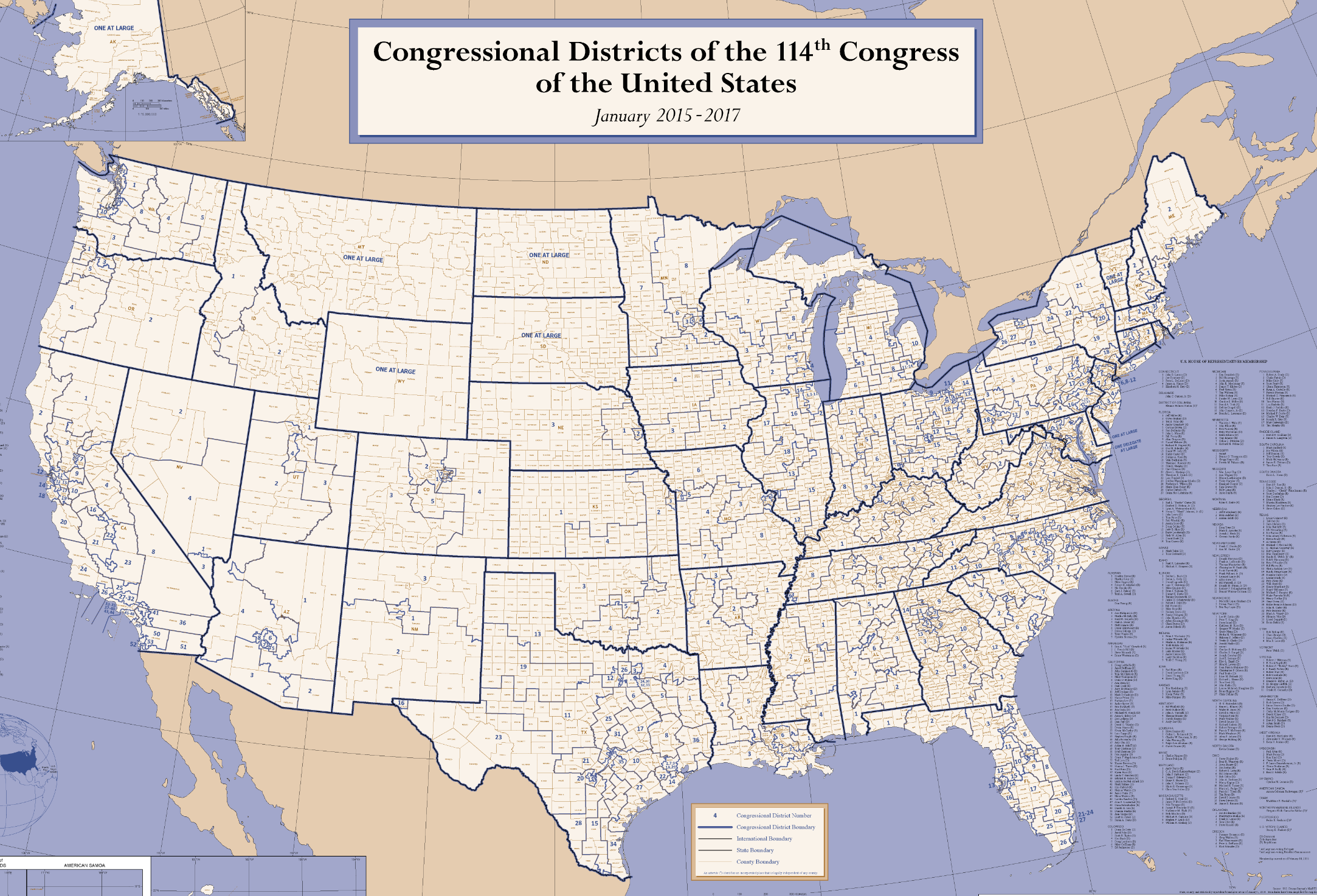
For reference's sake, this is what the Congressional Districts of the 114th Congress of the United States looks like as a wall poster, which you can download from the U.S. Census site:
The Census and the Congressional District shapefile data
The Census also provies the shapefiles for the district boundaries, i.e. the congress_districts_114th Dataset. You can download it yourself from the Census, or past Congresses boundaries, from the Census Cartographic Boundary Shapefiles - Congressional Districts
(If you haven't gotten the clue, the U.S. Census Bureau is the maintainer of this data, something that will make the suffering later in this lesson more bearable.)
Importing and creating a map from a shapefile
For our intents and purposes, cartographic shapefiles come as ZIP files. No need to unzip them ourselves. Import into Carto as if were just a CSV or any other data file.
Likewise, sreating a map from a dataset of shapes is same as creating map from CSV and points, except we'll get shapes, i.e polygons instead of points.
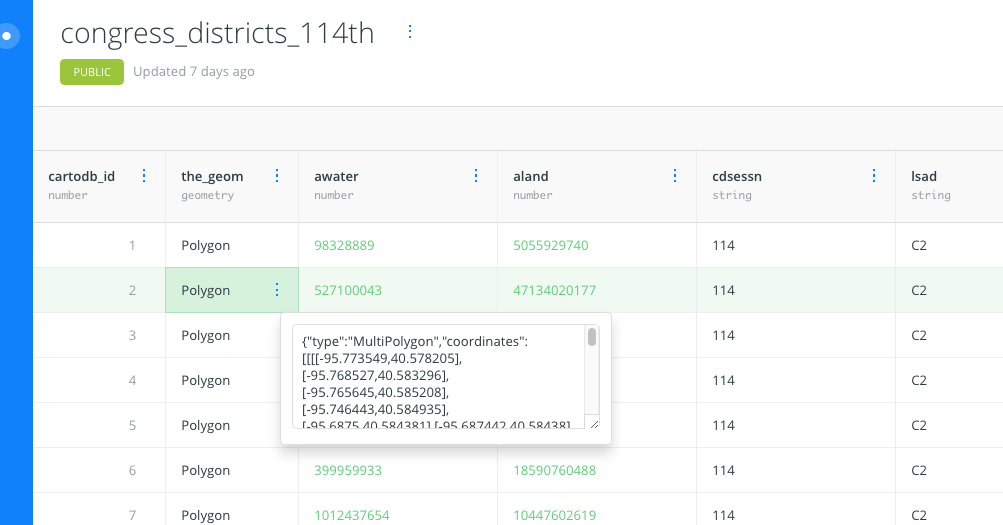
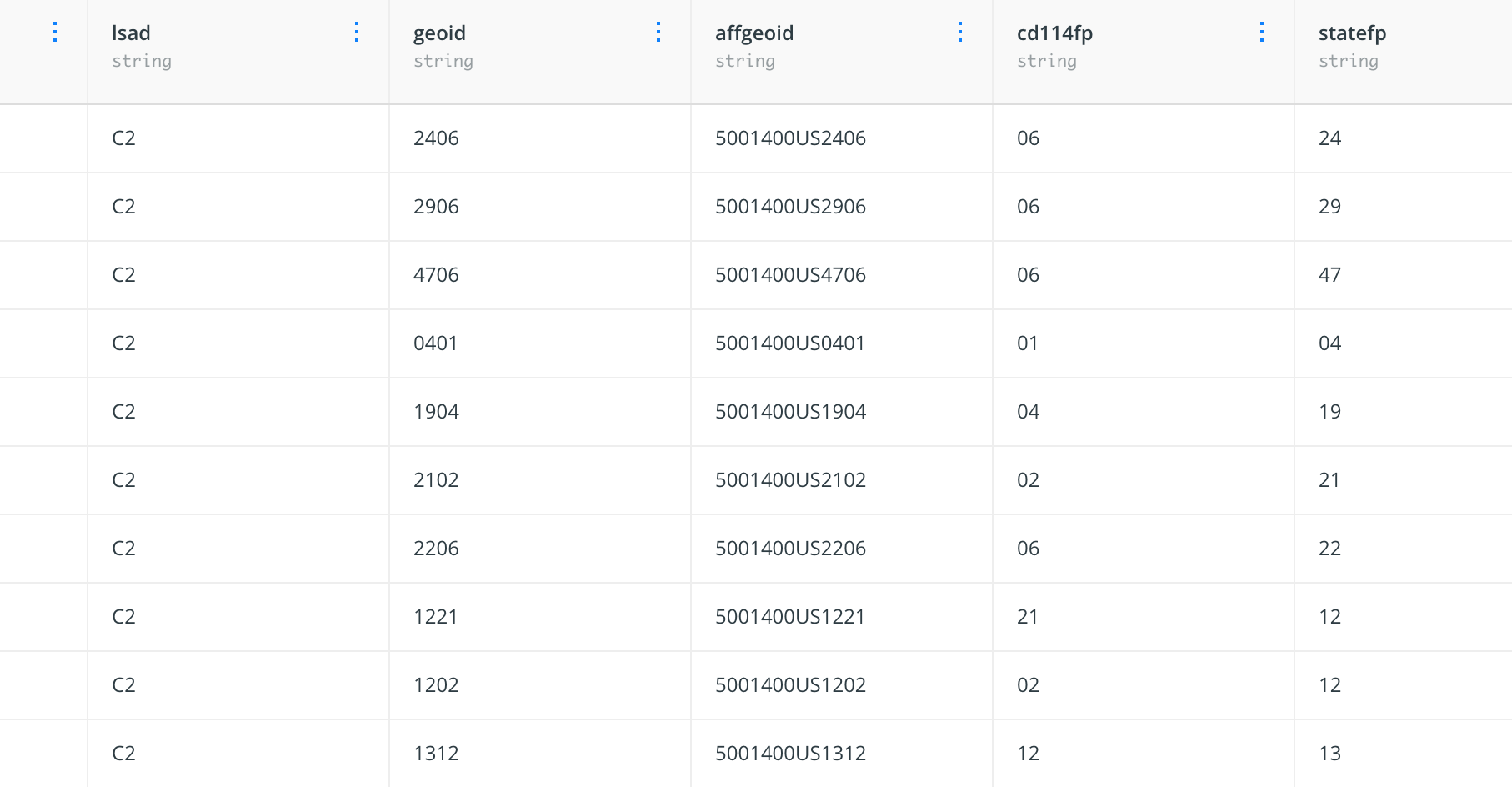
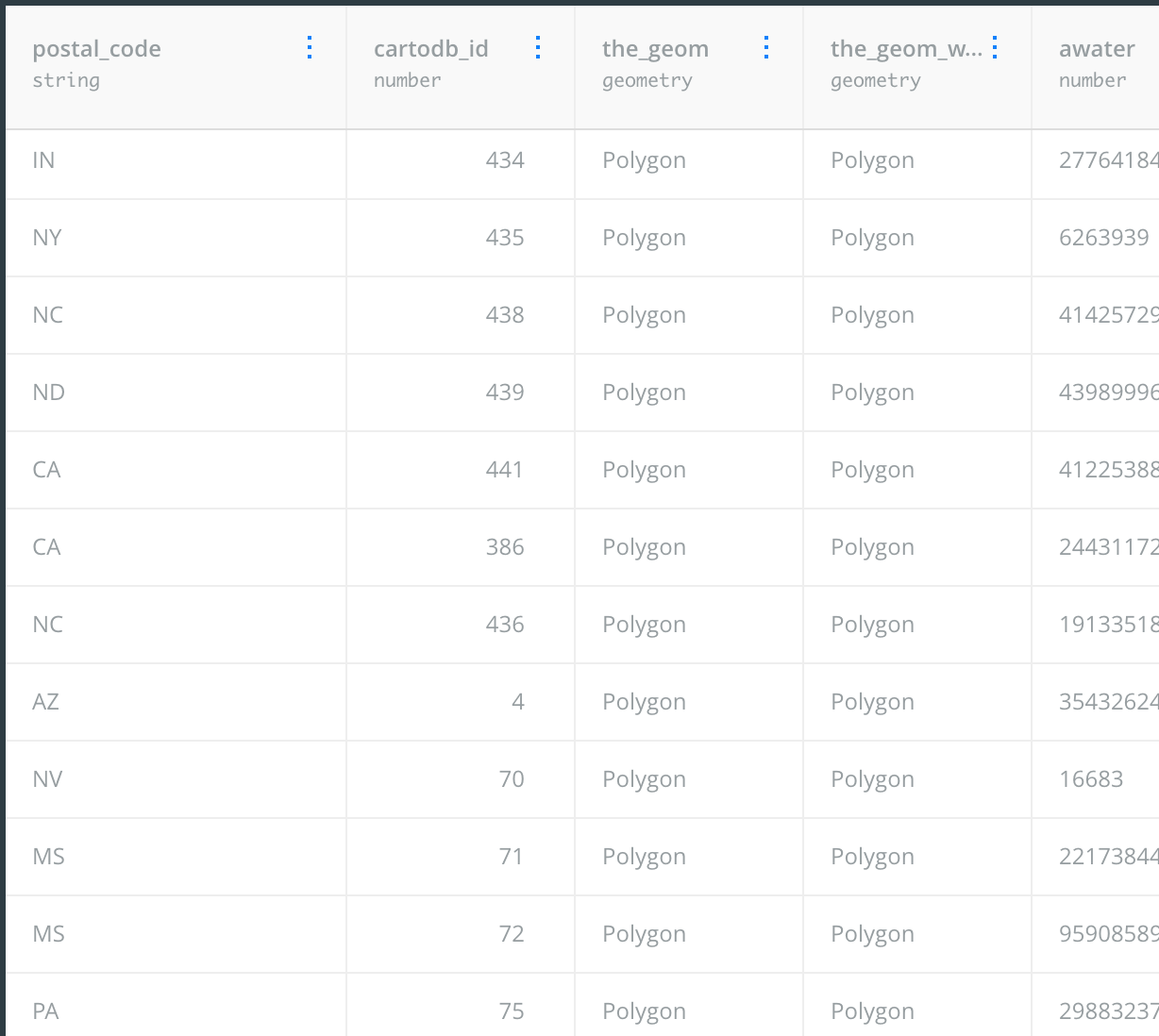
This is what the dataset looks like as a table:
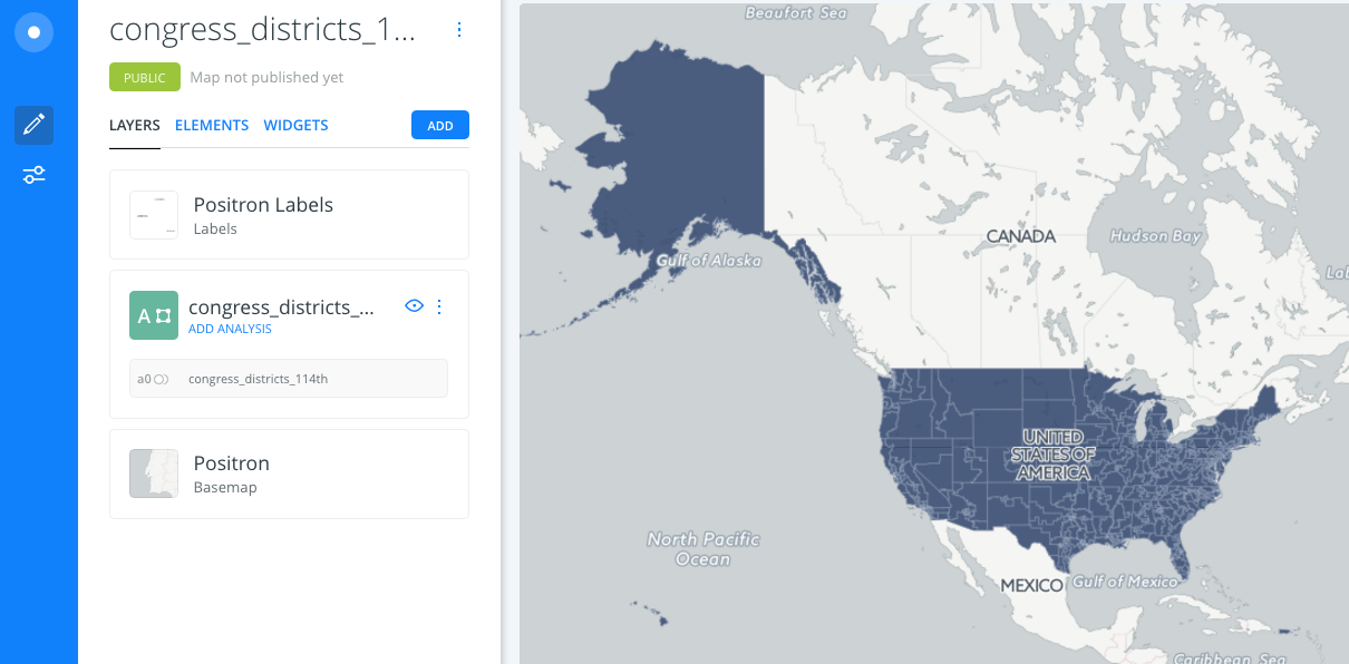
And Carto is easily able to map it like this:
Styling the fill and stroke of the polygons
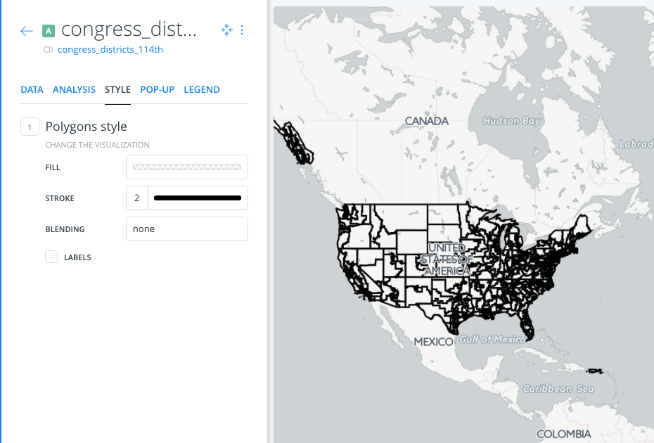
Go into the Layer > Style editor to set the Fill of each Polygon to 0.0 alpha (totally transparent) and a solid black outline:
Detour: Using NASA satellite photography to show urban density
In the next section, we're going to use SQL and JOIN statements to fix a real-world data problem – the lack of political data in the Congress district shapefile.
But let's pretend we didn't have SQL. Let's pretend we still wanted to show how congressional district boundaries mapped to population, but we didn't have another database table or spreadsheet.
Sans numerical data, let's use another kind of geospatial layer that purports to represent where humans live: satellite photography.
Carto has a section on Basemaps – the map layer underneath our data – that you can read for more detail. Here's what my map looks like when changing the Basemap from the default "Positron" style to the "NASA" Source, and "Night" Style:
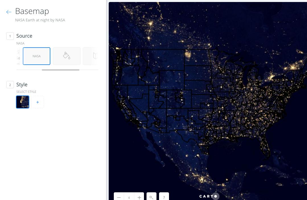
What happened to the outlines of our congressional districts? They need to be something that is not black. Go back into the Layer > Style editor to change the Stroke color to something like lavender:
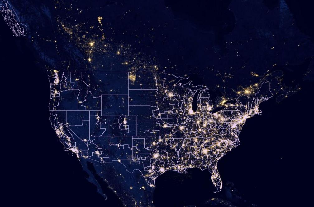
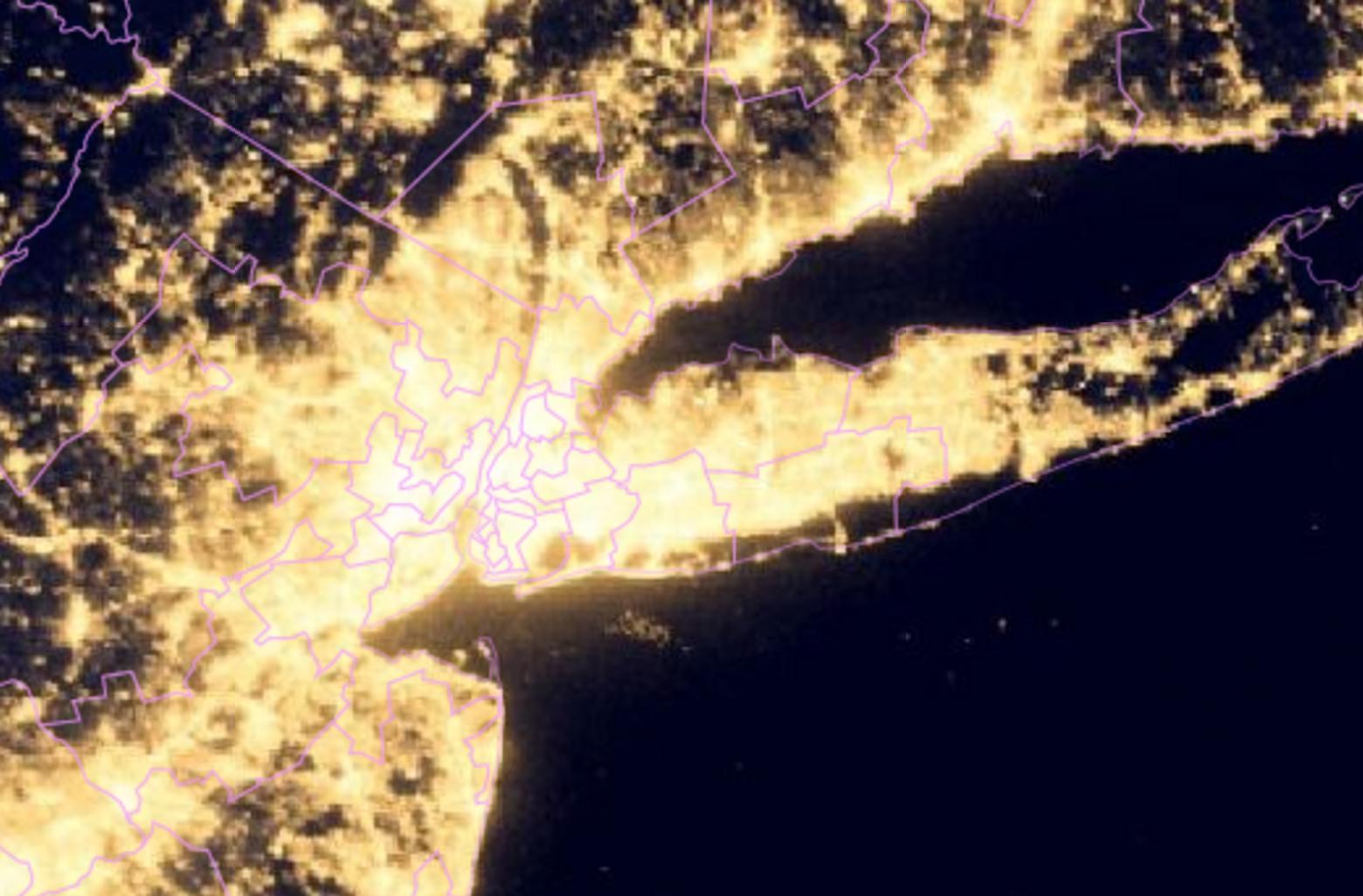
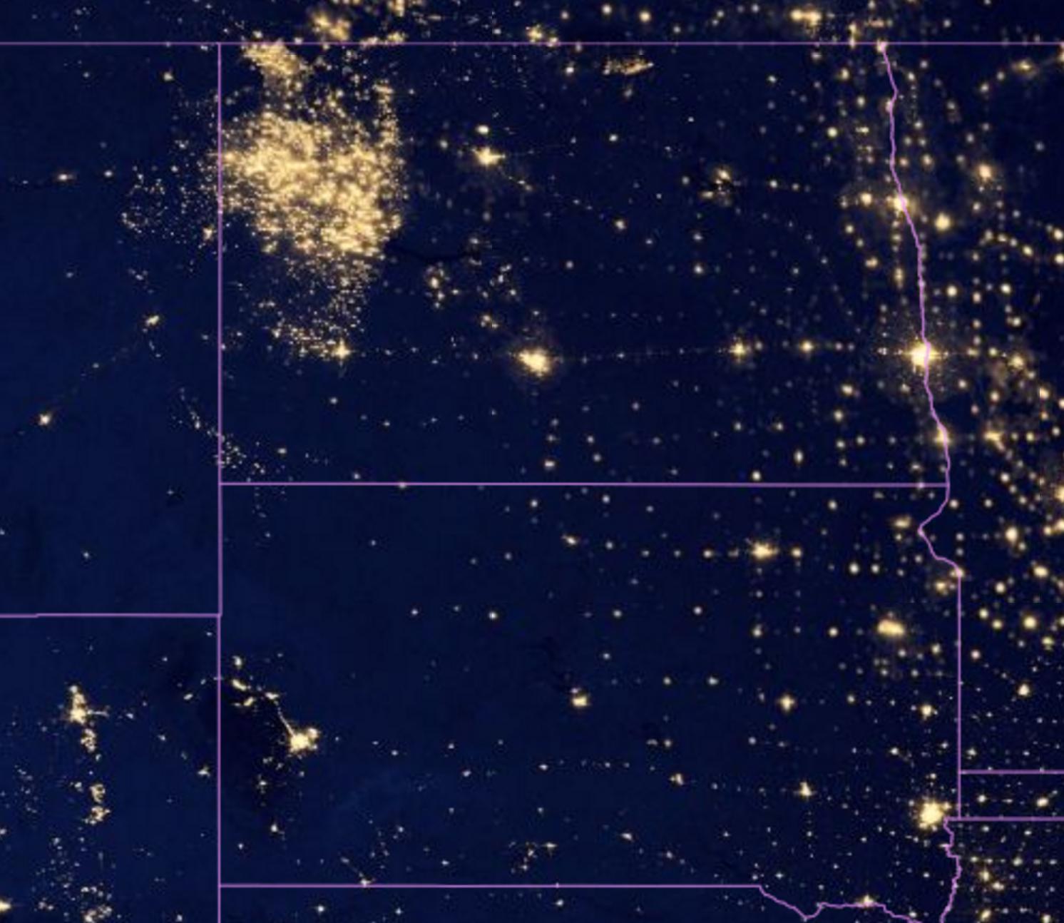
Human civilization generally needs light to live. It's a safe bet to say that where there are a lot of lights, according to NASA's photography, there are a lot of people. The density of Congressional district boundaries seems to correspond with the density of lights. Here's the boroughs of New York:
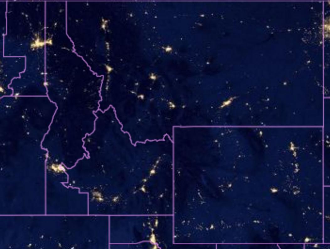
Meanwhile, Montana and Idaho, which have one at-large representative apiece, has very little light activity within their borders:
But lights == people doesn't always work. Look at North Dakota vs. South Dakota – both have a single at-large rep, but the North has something the South doesn't:
It's fun to play with the NASA imagery, but ultimately, we'll have to join the Census shapefile data with datasets that actually have a count of population and other human activity.
The limits of the Census
We know that the U.S. Census is tasked with counting people. But the shapefile data columns have no indication of this – that is, there is no population count per shapefile row. There's just identifiers:
And the Census also doesn't include information about each district's elected House Congressmember, which is the entire point of making Congress districts. This makes a little more sense – the Census's job is to track population data and boundaries – a district (or state's) congressmember could change literally every day.
Joining Congressional data with the shapefile data
So if we want our shapefile map to include red states for Republican congressmembers and blue for Democratic, we need to get that party data from another table. That's easy enough: get a spreadsheet of Congressmembers. The Sunlight Foundation tracks such data, the congressmembers.csv file I've provided is a mirror of that.
Using FIPS to join "congressmembers" and "congress_districts_114th"
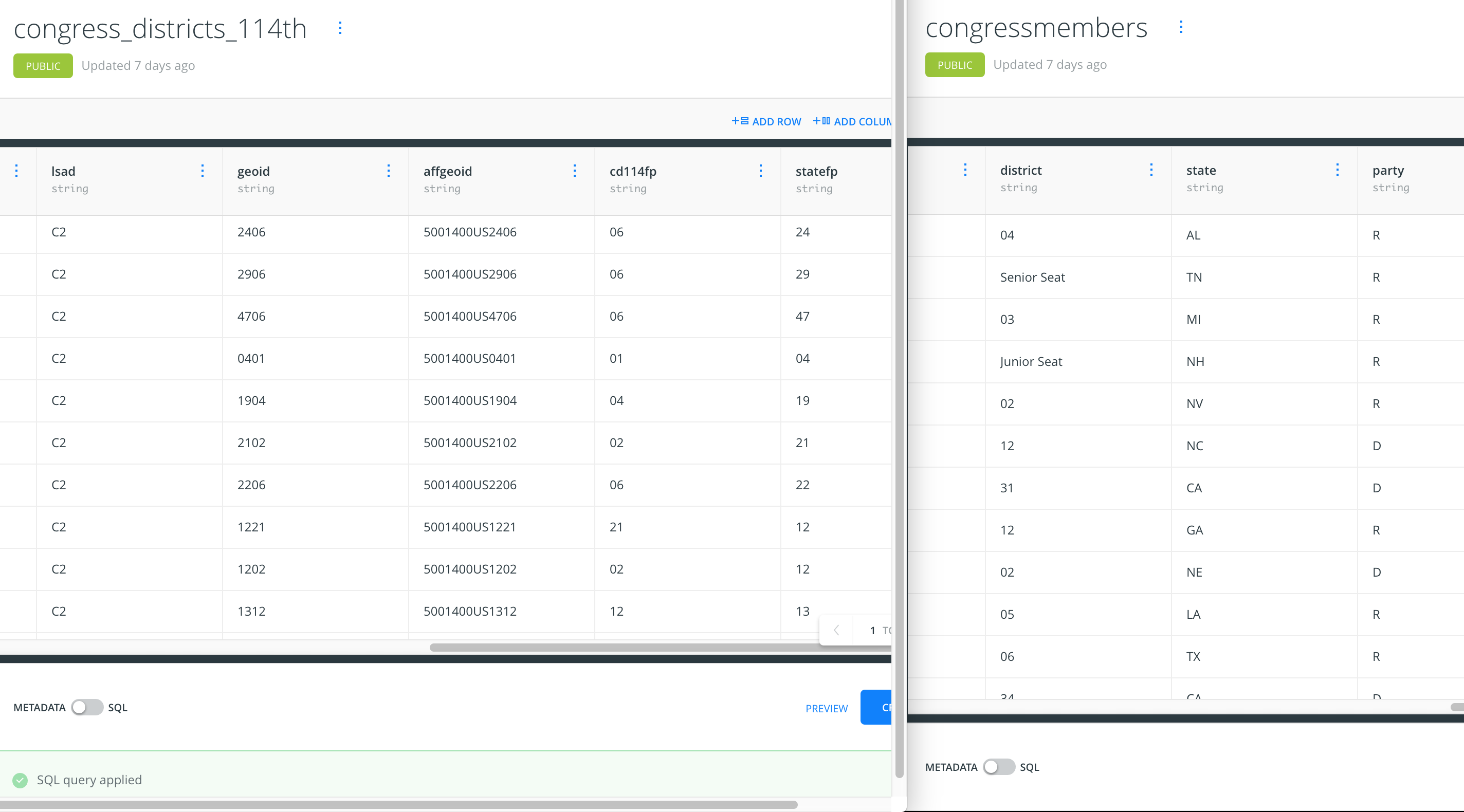
Ah but everything has to be difficult, doesn't it? The congress_districts_114th shapefile data doesn't have a column for state, it has statefps. And congressmembers doesn't have a FIPS number for state, it uses postal abbreviations:
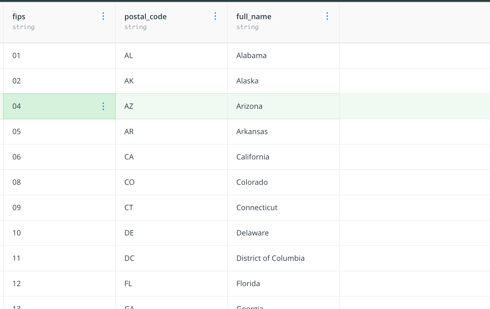
So we need to add another dataset, one that simply acts as a go-between a table with just postal codes, and another with FIPS. I refer to this as a lookup table, and it's as simple as it sounds:
Import it from this URL:
https://dannguyen.github.io/sql-carto-journalism-exercises/master/data/lookups/us_state_codes.csv
Mind the datatype of "fips"
One quick note about the fips column – note how the column is listed as having a datatype of string, which preserves the falues of 04 and 09, instead of non-zero-padded integers of 4 and 9 – we want that.
When importing the data, look in the lower-left column for the checkbox labeled, – and disable it:
SQL JOINS
SQL query to join the us_state_codes.postal_code column to every district shapefile:
(note that I've aliased the congress_districts_114th table as shapes and us_state_codes as lookups, for brevity's sake):
SELECT
  lookups.postal_code,
  shapes.*

FROM
  congress_districts_114th AS shapes

INNER JOIN
  us_state_codes AS lookups
    ON lookups.fips = shapes.statefp
To get the Congressional party data, e.g. D and R, it's just another join and another table. However, remember that we need to join ON
two fields:
- Where
congressmembers.state =us_state_codes.postal_code` - Where
congressmembers.district=congress_districts_114th.cd114fp, i.e. the district number of each house member
Note that I've aliased congressmembers as members:
SELECT
  lookups.postal_code,
  members.party,
  shapes.*

FROM
  congress_districts_114th AS shapes

INNER JOIN
  us_state_codes AS lookups
    ON lookups.fips = shapes.statefp
INNER JOIN
  congressmembers AS members
    ON
      members.state = lookups.postal_code
      AND members.district = shapes.cd114fp;
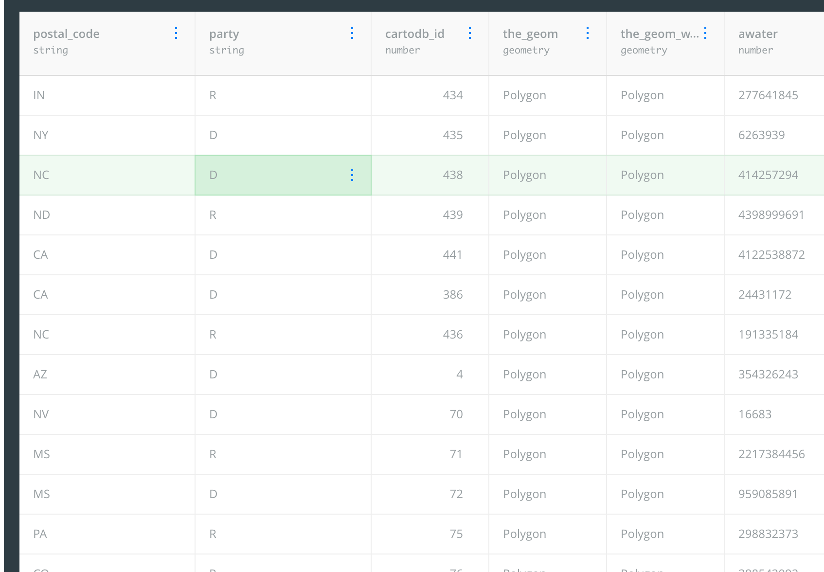
And look at that sweet, sweet, partisan data, attached to our congress_districts_114th columns (i.e. shapes.*):
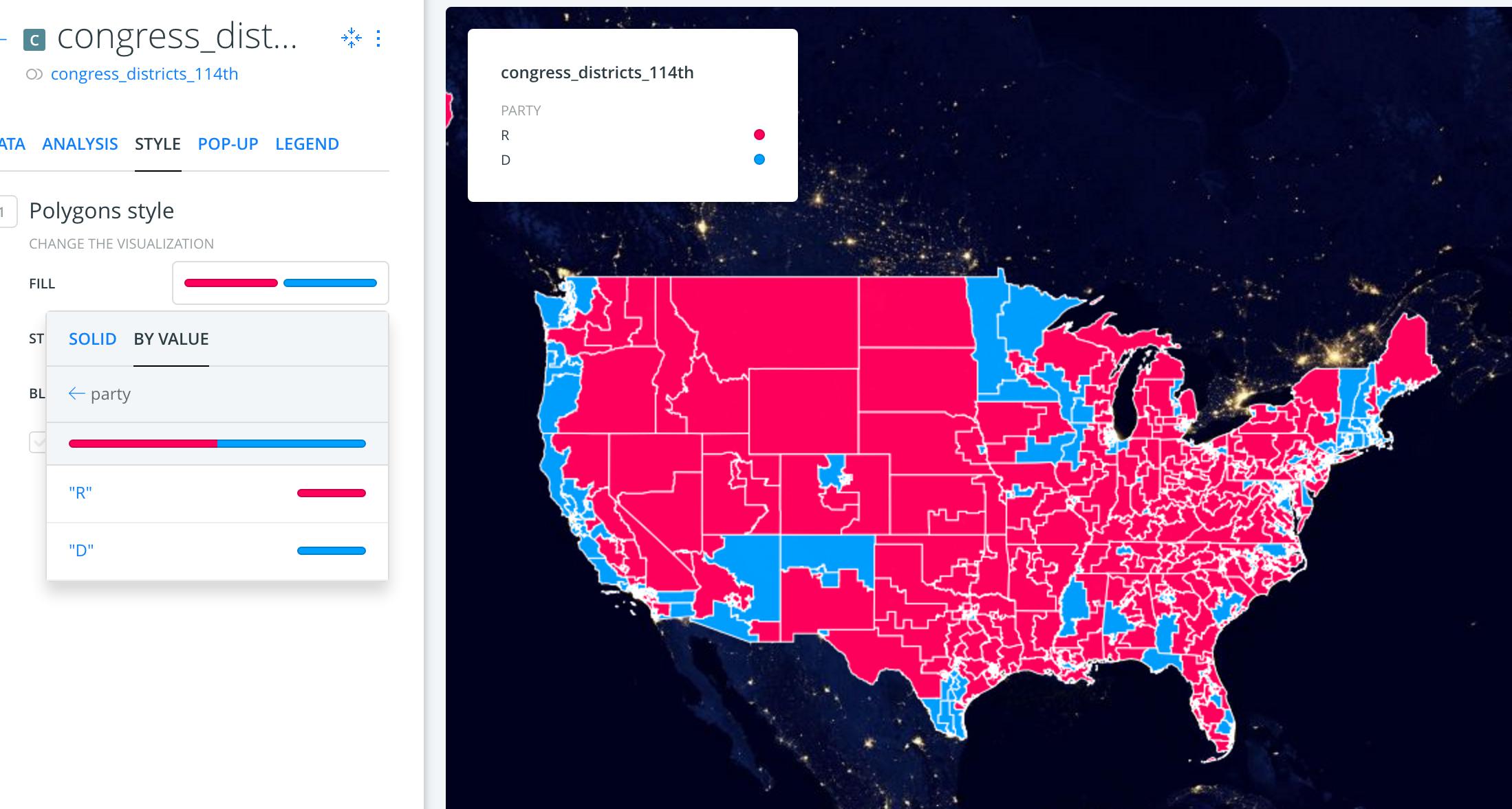
Styling the Congress district shapefiles, by fill value
Sex and Congress
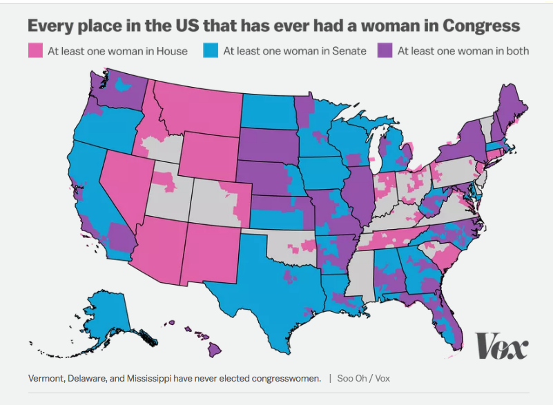
Let's try another angle on this particular map layer of Congressmembers and districts, inspired by: This map shows every place in the US that has ever had a woman in Congress.
It's just a matter of including the gender column:
SELECT
  lookups.postal_code,
  members.gender,
  members.party,
  shapes.*
/*everything else is the same*/
FROM
  congress_districts_114th AS shapes

INNER JOIN
  us_state_codes AS lookups
    ON lookups.fips = shapes.statefp
INNER JOIN
  congressmembers AS members
    ON
      members.state = lookups.postal_code
      AND members.district = shapes.cd114fp;
Unlike Soo Oh's map, we don't purport to color states by whether or not they have ever been represented by a woman. We just show which districts have a female House rep, as of the 114th Congress:
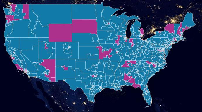
Here's Soo Oh's state map:
Starbucks and Gun shops
Inspired by Flowing Data, Firearms Dealers vs. Burgers, Pizza, and Coffee
Here's the relevant datasets. We'll stick to zip code boundaries since both the Starbucks data and gunshop data have it:
- https://dannguyen.github.io/sql-carto-journalism-exercises/data/shapefiles/zcta_simplified.zip
- https://dannguyen.github.io/sql-carto-journalism-exercises/data/wrangled/starbucks_locations.csv
- https://dannguyen.github.io/sql-carto-journalism-exercises/data/wrangled/atf_firearm_dealers_2016_08.csv
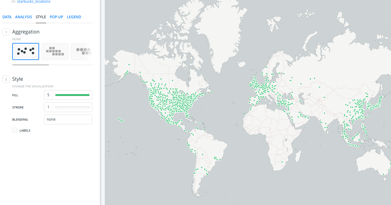
Starbucks (geospatial point data)
Let's start with starbucks_locations, because it has latitude and longitude fields and upon importing it, we will have a lot of cool dots.
I recommend making a whole new map, and use the Positron Lite layer. Go into the Layer > Style menu, where the default aggregation is just "none" (i.e. dots). Make them Starbucks green:
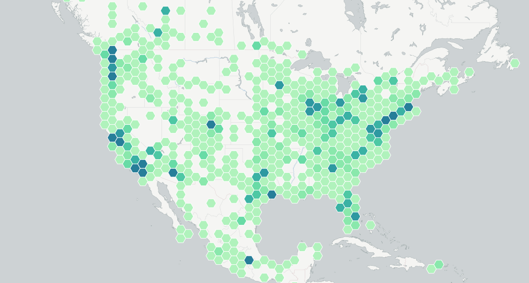
Hexbinning Starbucks
Tons of dots are not helpful. Let's try out the hexbin aggregation, which will look something similar to this:
(And this is where lesson abruptly stops for now…)