Project: Published/Partnered Data Sidebar
Alone, or with a partner, find a significant dataset or (several) that you want to dig into deeper. Use spreadsheets, SQL, Carto – whatever gets the job done.
-
A written piece of at least 500-800 words that is intended for a wider audience (i.e. not just me)
-
3 data visualizations. Can be maps, charts, tables, etc.
-
Use at least 2 datasets.
Basically, produce a story that for practical purposes, such as winter, can't rely on interviews or personal observation of an event, but is still interesting as an analysis. So, not breaking news, but describe the world with data.
You can work with a partner. Best thing to do this weekend is read and research. Look up datasets. We'll figure out the technical details next week.
Where to find 2 interesting datasets
I recommend sticking to CSV files. But I'll be around next week to help with tech support.
Places to find interesting datasets:
- OpenDataNetwork – find data across all city data portals with an easy search.
- MuckRock – reap the benefits of others FOIAs
- Enigma.io – a startup that crawls the web for huge public data sets.
Visualization inspiration
A catalog of inspiration: Spreadsheet-Made Data Visualizations That Are Relatively Simple and Absolutely Effective
I'll have a long list for next week, but here's a couple of visualizations doable by anybody, but undervalue as visualizations:
Tour de France dopes
Doesn't get much simpler than this:
http://www.smalldatajournalism.com/images/class/2013-10-21/tour-de-france-chart.jpg
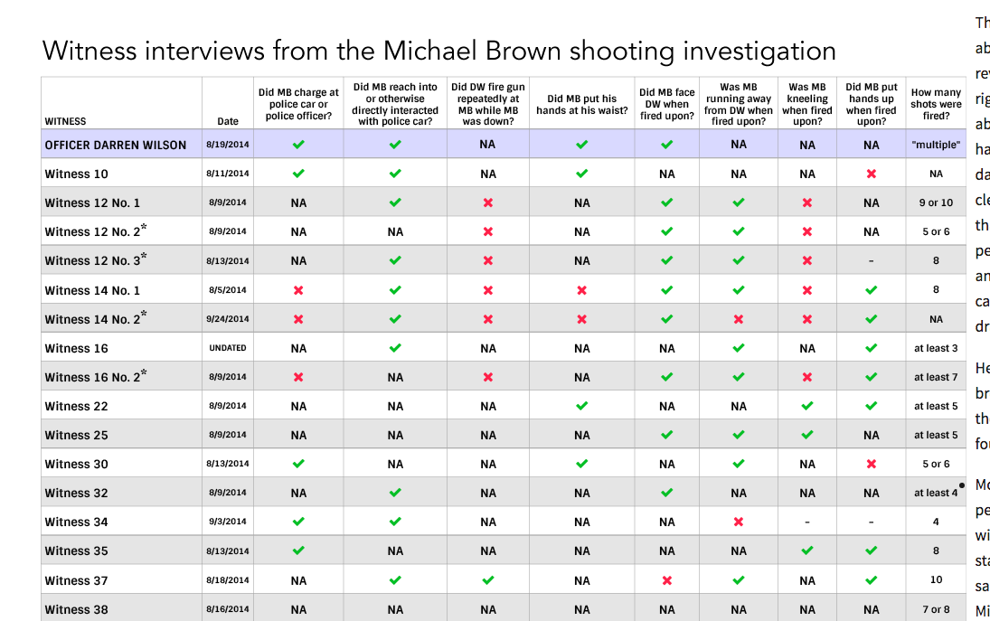
Ferguson's witnesses
Would you believe that a plain-old table could shine for such a charged and complicated story? There's a few ways that this chart could be polished, but that did it take to produce it? Reading the testimony, which you would do already. But also, being committed to finding the truth, as confusing or contradictory as it may seem:
Anti-word-clouding
Whatever you do, do the opposite of a word cloud
Examples to note
Remember the Social Security Administration babynames data? David Taylor did an excellent, multi-part analysis of the data using Tableau that helps reveal the depth and limitations of this data, and also, the history of getting a SSN:
<script type='text/javascript'> var divElement = document.getElementById('viz1480454393655'); var vizElement = divElement.getElementsByTagName('object')[0]; vizElement.style.width='644px';vizElement.style.height='929px'; var scriptElement = document.createElement('script'); scriptElement.src = 'https://public.tableau.com/javascripts/api/viz_v1.js'; vizElement.parentNode.insertBefore(scriptElement, vizElement); </script>
In a past session of this class, I walked through an example of how to use SQL to quickly find insights in a big dataset such as the SF crime data. It's a meandering writeup, but the nutgraf of a good data analysis and visualization are there: it's not that interesting that crime rises or falls a few percent every year. It is really interesting when certain crimes fall a lot over time.
And one of my all time favorites from I Quant NY: The NYPD Was Systematically Ticketing Legally Parked Cars for Millions of Dollars a Year- Open Data Just Put an End to It