Spreadsheet-Made Data Visualizations That Are Relatively Simple and Absolutely Effective
A non-comprehensive list of examples of powerful data storytelling in the wild that (likely) originated with a spreadsheet.
A short list of visualizations within the technical means of anyone who knows how to use a spreadsheet, yet demonstrate an adept journalistic skill in how to filter the data and get to the story.
A list of lists of data visualizations
For much of inspiration, a list of lists:
- ProPublica
- Quartz roundups:
- New York Times roundups:
- Megan Jaegerman's brilliant news graphics, according to Tufte
- BuzzfeedNews Github Repo
- FiveThirtyEight
Lists and tables
Visualizations that basically look like a spreadsheet:
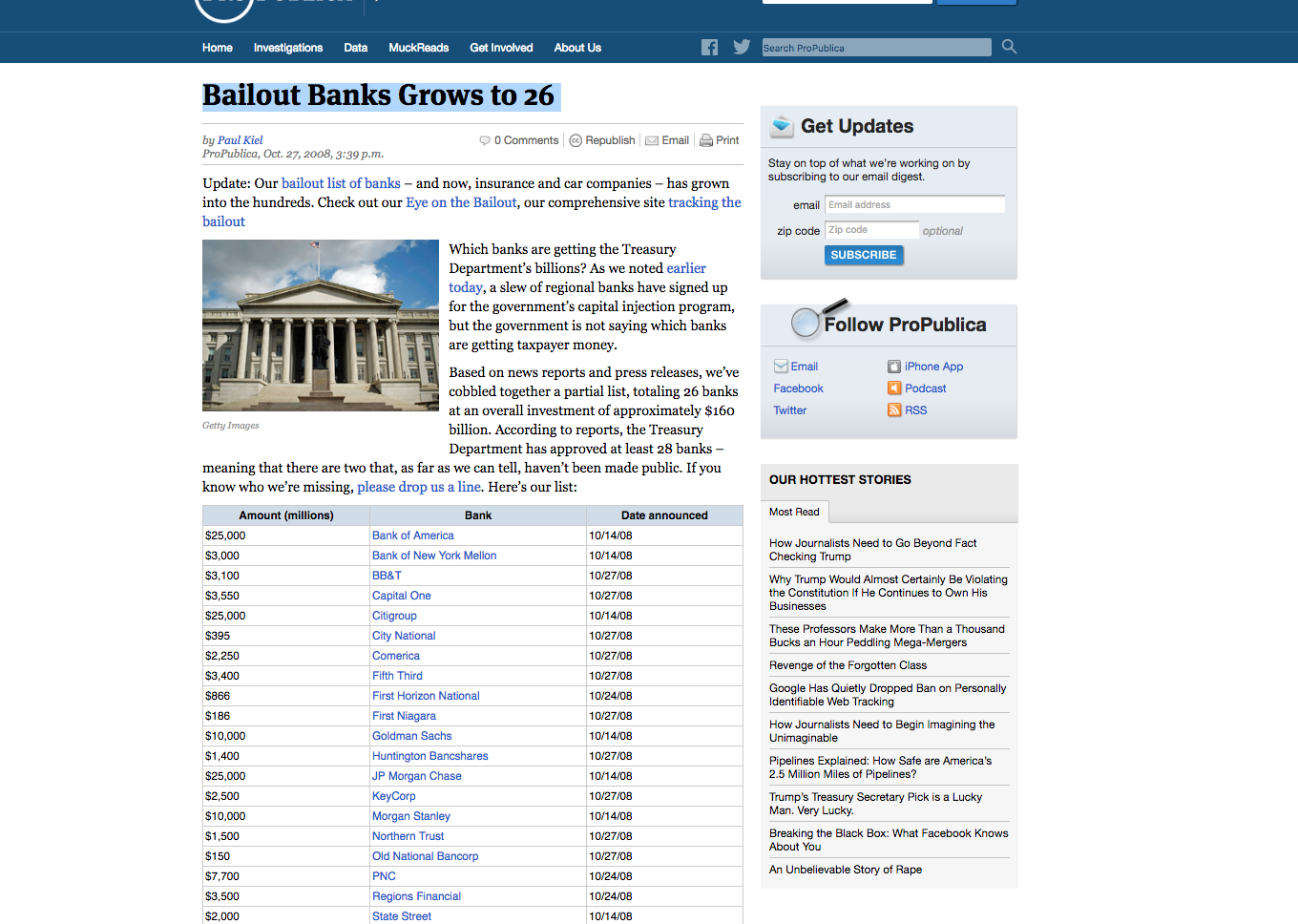
Bailout Banks Grows to 26
ProPublica's first big data application started out with just a hand-curated spreadsheet of banks that proudly announced they were "healthy" enough to get a federal bailout.
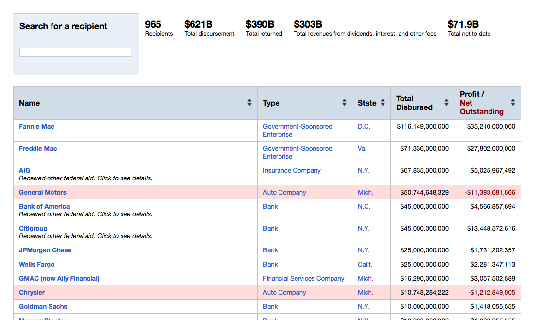
Eye on the Bailout: Bailout Recipients
The bailout recipients table, as a fancier table.
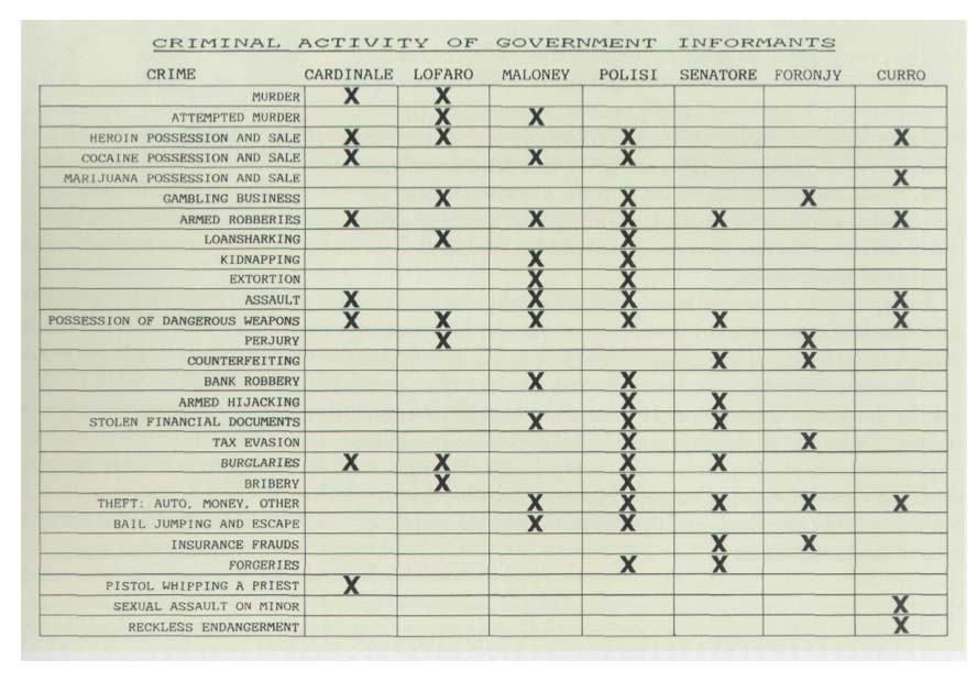
Criminal Records of Government Witnesses Against John Gotti
One of Edward Tufte's classic examples of "Small Multiples" comes from a New York Times article citing a particularly effective chart used by John Gotti's defense team: A WEAKNESS IN GOTTI CASE; Major U.S. Witnesses Viewed as Unreliable:
Many lawyers and prosecutors who followed events in the seven-month trial of John Gotti said the underlying weakness of the prosecution’s case was its apparent reliance on turncoat career criminals as key witnesses against Mr. Gotti and six co-defendants.
A signal that the credibility of the prosecution’s principal witnesses was in doubt came yesterday morning when the jury…reviewed an exhibit introduced by the defense. It was a chart listing the lengthy criminal records of seven prosecution witnesses who had obtained promises of leniency and other favors from the Government in return for their testimony against Mr. Gotti. Admitted Lies in the Past
Here's what that jury-convincing chart looked like – Note how vertical position is used to indicate severity of crime – Murder vs Reckless Endangerment. And while each column represents a defendant, it gets from most to least serious, with the two witnesses alleged to be murders having the most horizontal priority.
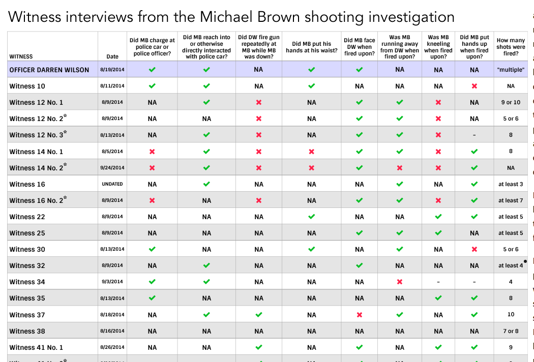
What do the newly released witness statements tell us about the Michael Brown shooting?
Fantastic example of how to turn dense text into an immensely valuable visualization. It requires old-fashioned reading and research of the witness testimonies and then deciding what categories and boolean tests, e.g. Did witness testify yes or no to, "Did [Michael Brown] put his hands to his waist?". A more complicated version of our homework, Cataloging Google's Self-Driving Car Accidents
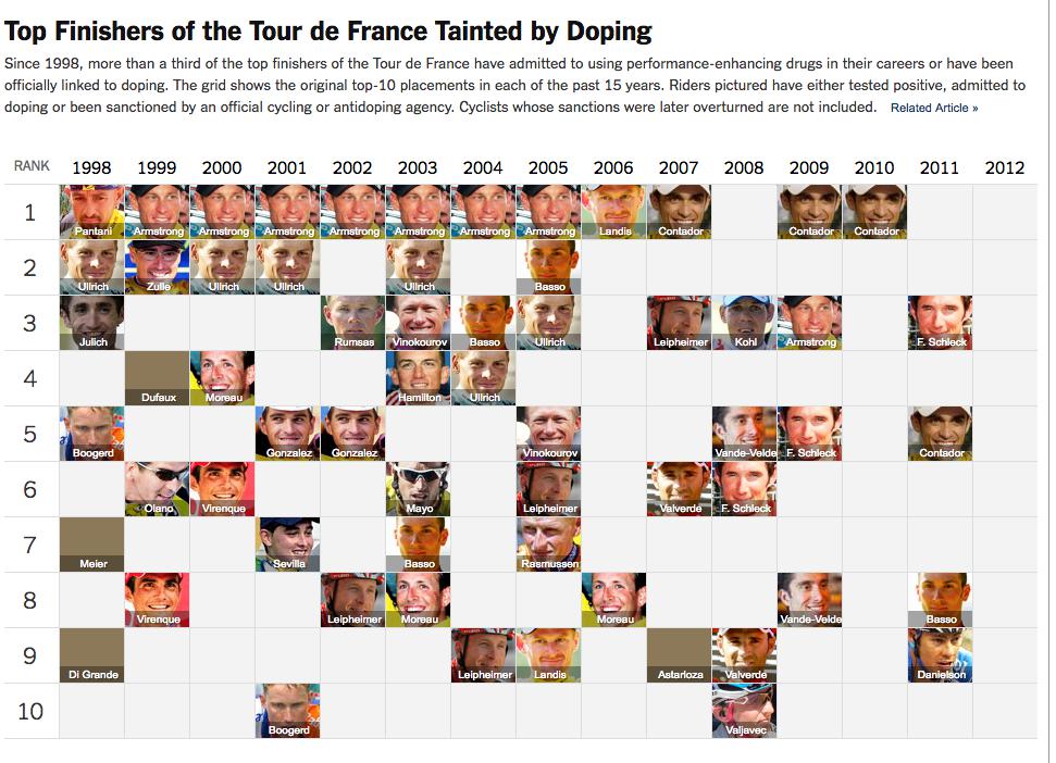
Top Finishers of the Tour de France Tainted by Doping
Think of this as a pivot table with "Rank" as the row and "year" as the column, and instead of just "Armstrong" as the value, a thumbnail of the victor's face.
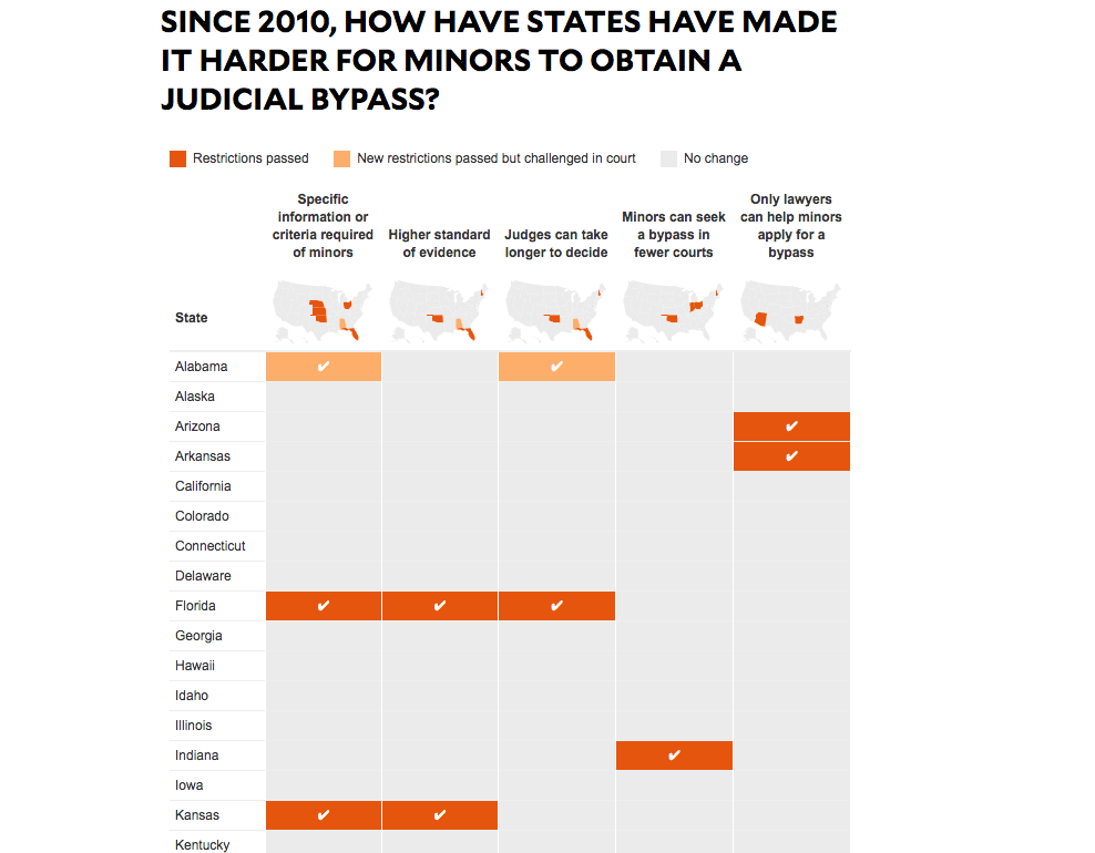
Since 2010, How Have States Have Made It Harder For Minors To Obtain A Judicial Bypass?
The simplified-maps atop each column is a nice feature for showing, at a glance, the scope of effects across the nation, as the list of states is too long to fit on a screen. But the real power in this visualization comes from, again, the state-by-state research, particularly knowing which five boolean comparisons are worth making across every state.
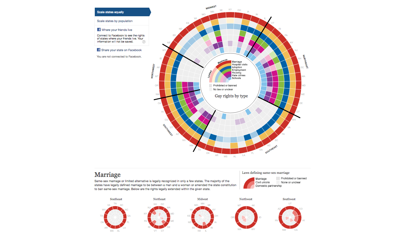
Gay rights in the US, state by state
This is a spreadsheet, but they decided to make it circular to make it easier to view all 50 states at once. The tool/technique to make that circle isn't as important as much as the research, cataloguing of research-by-state, and making a spreadsheet.
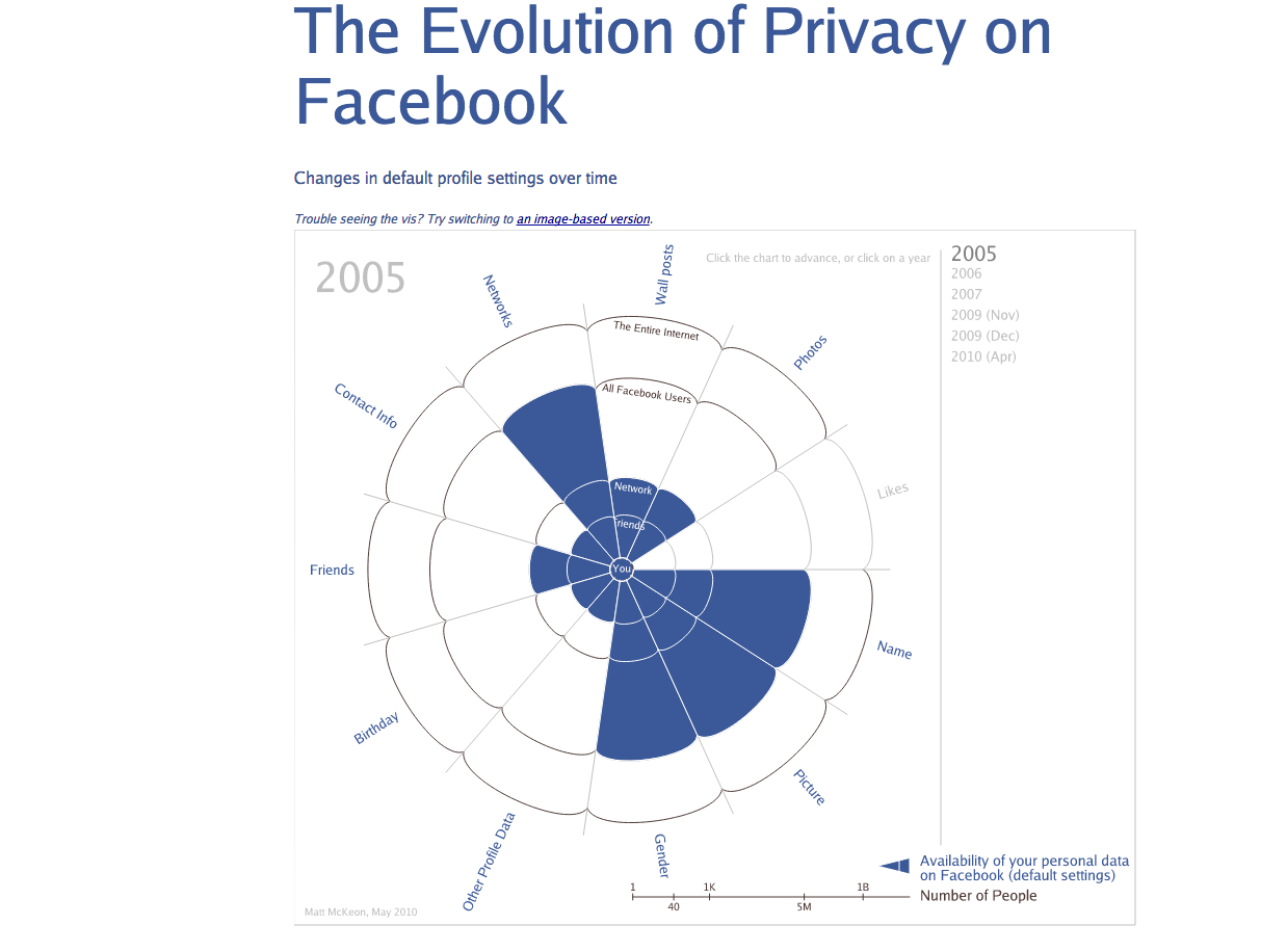
The Evolution of Privacy on Facebook
Fancier-looking version of Guardian chart, with simpler data, but still based on smart research and spreadsheeting. Anyone with research skills and access to Google could build this kind of table for any social-media service.
How They Got Their Guns
This doesn't look like a list, but it most certainly had to begin as a list of incidents and guns, sorted in reverse chronological order. That they chose to "visualize" with photos of guns and paragraphs of text is just one example of how to make a list more than just a simple list:

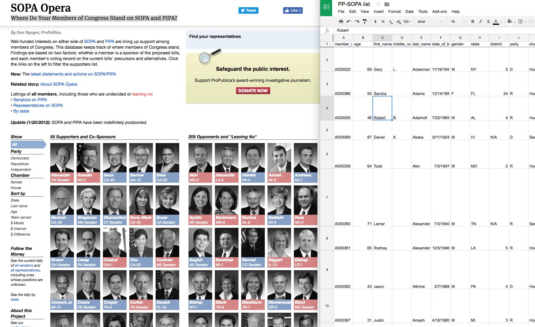
Where Do Your Members of Congress Stand on SOPA and PIPA?
This visualization got more than a million page views in a day, and it all began with a list of Congressmembers and Googling of press releases:
Charts
Just your typical line and bar charts.
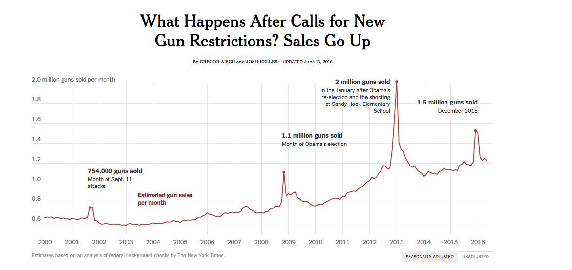
What Happens After Calls for New Gun Restrictions? Sales Go Up
An example of the power of "captions". A line chart of gun sales is easy to make. But these annotations, which can be added in manually (via Illustrator/Photoshop), add powerful context:
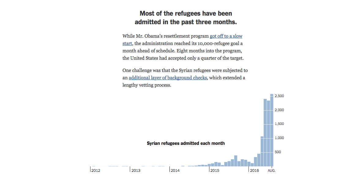
Syrian refugees admitted each month
Time-series of what could be mapped data; the increase in frequency of admitted refugees is as interesting as where they ended up.
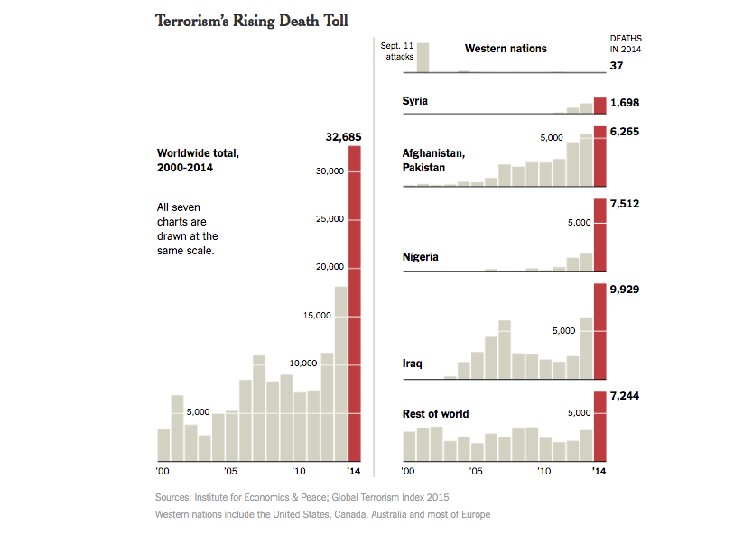
Terrorism's Rising Death Toll
Terrorism is tricky and controversial todefine, so show what the data includes in terms of the total aggregate (worldwide total), as well by individual country, to give proper persective to reader.
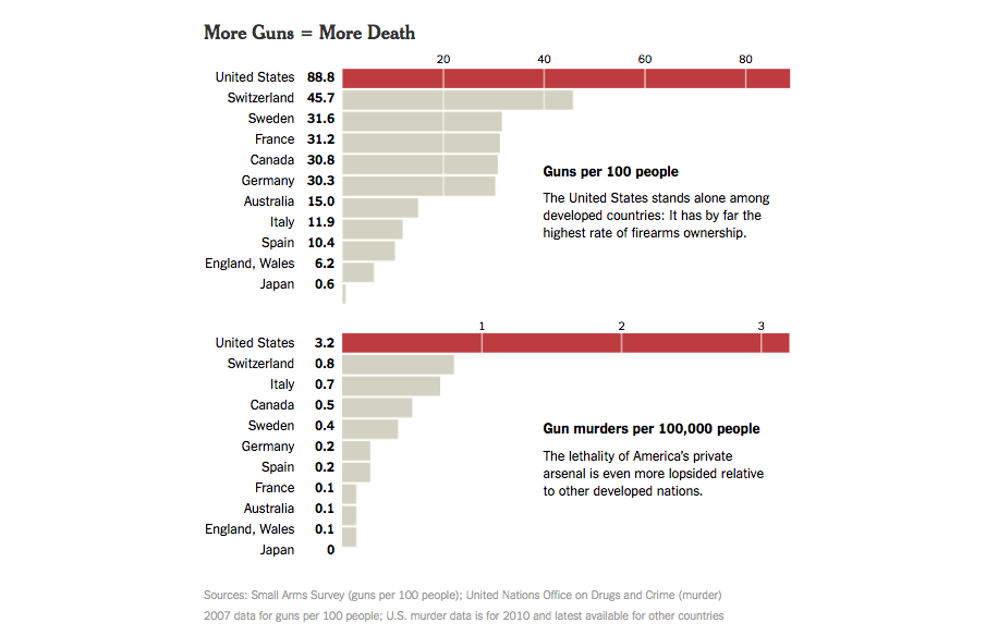
More Guns = More Death
Considering the impact of gun ownership on gun-related deaths is more complicated than just showing absolute number of gun-related deaths. So the NYT juxtoposes two different rates to show the sheer magnitude of the U.S. being an outlier.
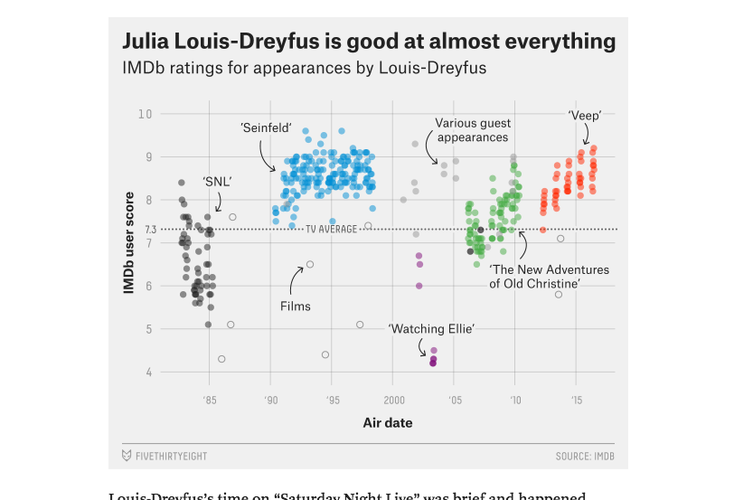
Julia Louis-Dreyfus Is Unstoppable
This is just a multiseries scatterplot, where each data point is consists of the date of movie/tv-show on X-axis, IMDB score on the Y-axis. The different series (i.e. categories) is what's hand-labled on the cart, e.g "Films" and "Various Guest Appearances" to show that, except for the show Watching Ellie, JLD was a fan-favorite.
Text analysis of Trump's tweets confirms he writes only the (angrier) Android half
Despite the interesting statistical analysis of the raw Twitter data, this is basically a bar chart, with smart filtering and styling to reveal an insight about how Trump tweets.
I like this writeup particularly because it shows the wealth of analyses possible even from word counts. In other words,another argument on how word clouds are not just the most laziest and misleading of data visualization but pointlessly ineffective, too.
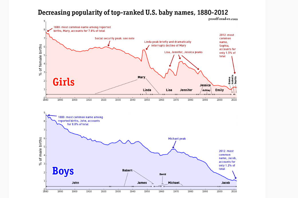
U.S. baby names, 1880-2012: Diversity
Think of "dominance of popular names" as a proxy for, "diversity of population".
Maps
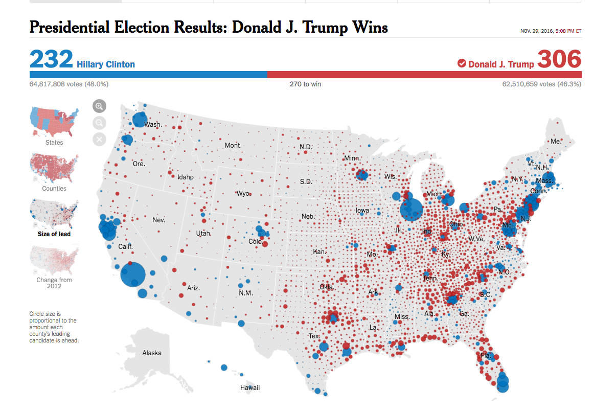
Presidential Election Results: Donald J. Trump Wins (County, by Lead)
The typical election-result-by-political boundary will be a sea of red, because of the way rural areas skew Republican. This dot-size map shows something more interesting, by first doing the work of comparing 2 sets of election data before charting the circles.
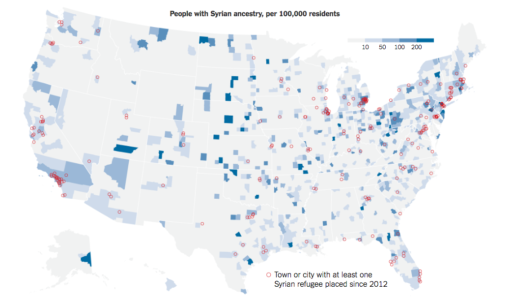
People with Syrian ancestry, per 100,000 residents, and cities with at least one Syrian refugee placed since 2012
The U.S. Census has a data table, "People Reporting Single Ancestry", with Syrian as a specific category, which is used to make the choropleth county map (shaded by value). The red circles are just point data for cities that have accepted at least one Syrian refugee.
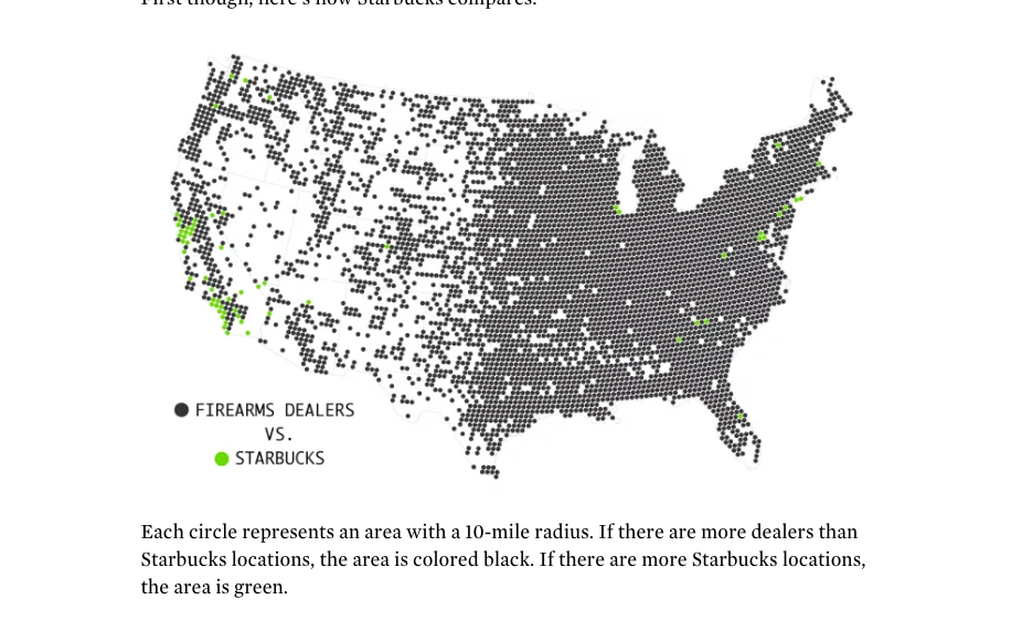
Starbucks vs. Firearms Dealers
Your typical density/binning-mao: Starbucks minus gunshops per radius is calculated. Green dots are where the number is positive:
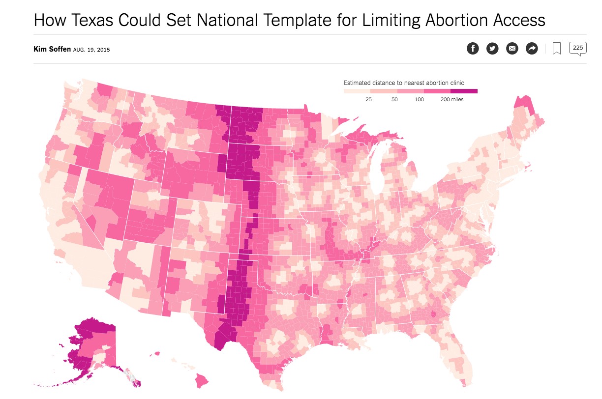
How Texas Could Set National Template for Limiting Abortion Access
Both simpler and harder than the Starbucks/gunshops map: just need one dataset, the list of abortion clinics. However, is that list harder to get than a list of Starbucks and/or gun shops?
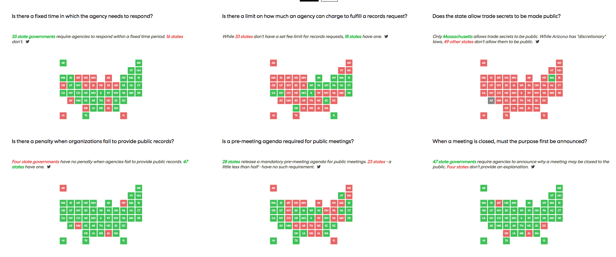
State Secrets: Open records laws across the nation </h3>
An example of a cartogram: representing states as something other than their normal geospatial boundaries (see also, Soo Oh's "not so bad" election maps). Uses the small-mutliples pattern. And most definitely something that started out with a spreadsheet, a row for every state, and predefined category/columns.
Unconventional
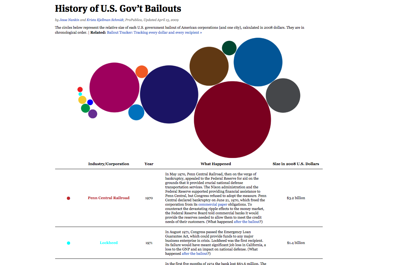
History of U.S. Gov’t Bailouts
The first big data hit at ProPUblica, before actual money amounts were declared for the Treasury bank bailout in the post-2008 recession. People didn't know what other big bailout America had participated in, so ProProblica looked it up. The visualization's bubbles are all hand-placed:
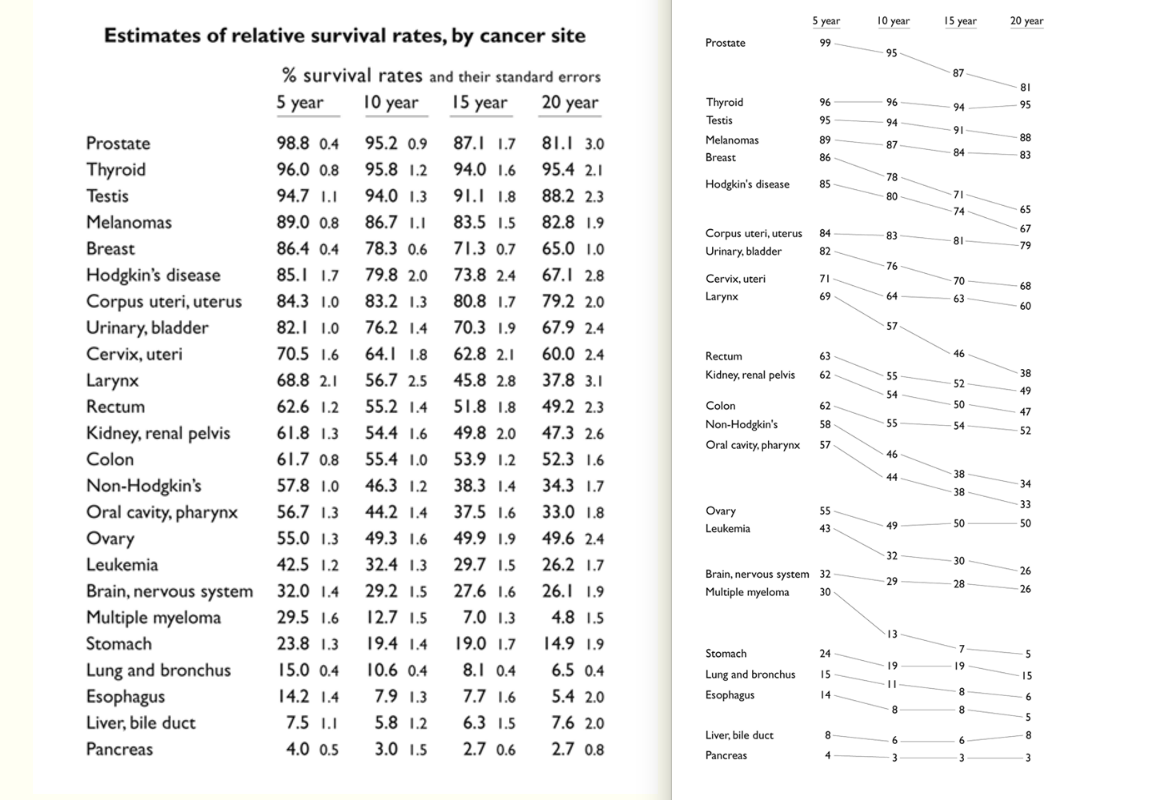
Tufte's Cancer Slopechart
Raw data lists/tables are rarely effective data visualizations on their own, as the pure amount of text results in too much data ink to easily read. The slope chart is en example of how powerful straight lines and text can be, with relative positions being all that's needed to show both relative change and absolute values.
A Timeline of Earth's Average Temperature
A long list of data values with descriptive text, converted to a line chart. When Excel/Google Charts can't create a chart big enough to fit your data, you may need to filter/aggregate your data. Or, you may need to draw your own chart:
