ALS Icebreaker Challenge
By now, revenues from the wildly successful ALS Icebucket Challenge are reflected in the latest 990s. What can we find out about how the money was used?
What is the Ice Bucket Challenge
Via Wikipedia:
The Ice Bucket Challenge, sometimes called the ALS Ice Bucket Challenge, is an activity involving dumping a bucket of ice and water on someone's head to promote awareness of the disease amyotrophic lateral sclerosis (ALS, also known as motor neurone disease and in the US as Lou Gehrig's Disease) and encourage donations to research. It went viral on social media during July–August 2014.
Who Invented the Ice Bucket Challenge? A Slate Investigation.
No matter the answer, it’s clear that the year’s biggest viral trend isn’t about any single person. Rather, it’s one of the best examples we’ve ever seen of the Internet’s amazing ability to connect people and spread ideas. A dumb drinking game is maybe, possibly, the origin of a fundraising drive that raised more than $50 million for ALS. How cool is that?
Also: Ezra Klein explains the ice bucket challenge
The serious point here is that this is about giving to charity. Lou Gehrig's disease is a horror and I'm excited to support the ALS Association's efforts. But the Ice Bucket Challenge has been so effective at raising money that the ALS Association is likely bumping against the limits of what they can spend effectively. And, of course, ALS isn't the only awful disease out there.
Examples of the Ice Bucket Challenge
Aftermath and the backlash
The "Criticism" section takes up about a third of the Wikipedia article on the challenge:
A number of criticisms arose relating to the campaign, accusing it of being self-congratulatory, focusing primarily on fun rather than donating money to charity, and substituting a trivial activity for more genuine involvement in charitable activities. Writing in The Daily Telegraph, Willard Foxton described the challenge as "a middle-class wet T-shirt contest for armchair clicktivists", and the Evening Standard Magazine said that "it has become less about raising funds and all about showing off your star-pulling power".
Stop Dumping Ice on Your Head. Just Give Money.
1. Do not fetch a bucket, fill it with ice, or dump it on your head.
2. Do not film yourself or post anything on social media.
3. Just donate the damn money, whether to the ALS Association or to some other charity of your choice. And if it’s an organization you really believe in, feel free to politely encourage your friends and family to do the same.
Seems to have resulted in something…
The ice bucket challenge worked: There’s been a breakthrough in ALS research
The Ice Bucket Challenge began as a campaign by the charitable ALS Association to raise awareness and donations for research on the disease. As netizens took it to heart in a summer fever, some forgot to mention ALS or the campaign altogether. Critics bemoaned the passive “slacktivism.” But the campaign raised a staggering $115 million in six weeks, which the ALS Association immediately put to good use, pledging $21.7 million to six programs searching for treatments and a cure. (It put the rest into investments.)
But don't overlook the concept of priorities
Is charity donation a zero-sum game?
The cold, hard truth about the ice bucket challenge:
(emphasis mine)
The key problem is funding cannibalism. That $3 million in donations doesn’t appear out of a vacuum. Because people on average are limited in how much they’re willing to donate to good causes, if someone donates $100 to the ALS Association, he or she will likely donate less to other charities.
This isn’t just speculation. Research from my own non-profit, which raises money for the most effective global poverty charities, has found that, for every $1 we raise, 50¢ would have been donated anyway. Giving What We Can fundraises for global poverty charities by encouraging people to pledge at least 10% of their income. For everyone who joins, we ask them to estimate what proportion they would have donated otherwise. Averaged among all our members, that amount is greater than 50% (or $150mn out of $300mn). Given our fundraising model, which asks for commitments much larger than the amount people typically donate, we have reason to think that this is a lower proportion than is typical for fundraising drives. So, because of the $3 million that the ALS Association has received, I’d bet that much more than $1.5 million has been lost by other charities.
As an aside: How would we try to quantify whether the Ice Bucket challenge negatively
The truth about the Ice Bucket Challenge
Sometimes our decisions about donating don't even seem to be driven by values or potential impact — but by celebrities and the entertainment value of the fundraising campaigns they endorse. Look no further than the ALS Ice Bucket Challenge. The feel-good campaign works like this: you film yourself throwing a bucket of ice over your head, post it to social media, and then challenge your friends to either do the same or donate $100 to the ALS Association, which works to end Lou Gehrig's disease.
Between 5,000 and 6,000 people in the US die from ALS every year. (The most accurate and recent data available came from CDC, which reported that 6,849 people died from motor-neuron diseases including ALS in 2011.) To put that number into context, consider the chart below: it shows money raised from popular fundraisers and the number of related disease deaths.
/cdn0.vox-cdn.com/uploads/chorus_asset/file/676096/fundrasing4disease.0.jpg)
You'll notice that large fundraisers can have a pretty significant impact on raising money for causes — and also that there are big gaps between the diseases that affect the most people and those that net the most money and attention.
Sidenote on simplifying visualizations
An easy guideline for good visualizations: make it easy for the reader.
The Vox chart is hard on the reader for a few reasons:
- Separating the labels from the bubbles requires you to memorize the meanings of 8 different colors in order to know which bubble represents which disease.
- If you're color blind, you're screwed.
- Even if the bubbles were better labeled, it requires work to compare the left-side bubble with its right-side counterpart. Edward Tufte's slopegraph is one way to counter this.
- It is inherently difficult for people to visually quantify and compare areas. Which is why stacked bar charts are often preferable to pie charts. Again, Tufte, here and here.
Possible simplifications
First, let's put the data into a table; here's my Google sheet:
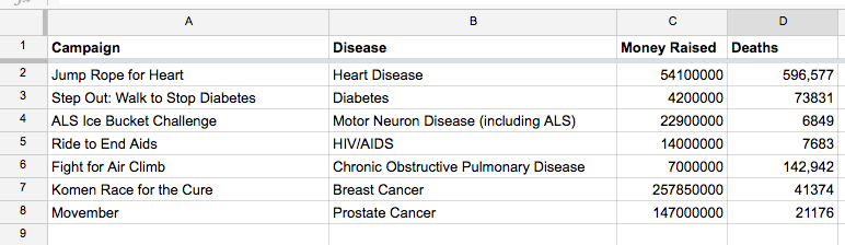
| Campaign | Disease | Money Raised | Deaths |
|---|---|---|---|
| Jump Rope for Heart | Heart Disease | 54100000 | 596,577 |
| Step Out: Walk to Stop Diabetes | Diabetes | 4200000 | 73831 |
| ALS Ice Bucket Challenge | Motor Neuron Disease (including ALS) | 22900000 | 6849 |
| Ride to End Aids | HIV/AIDS | 14000000 | 7683 |
| Fight for Air Climb | Chronic Obstructive Pulmonary Disease | 7000000 | 142,942 |
| Komen Race for the Cure | Breast Cancer | 257850000 | 41374 |
| Movember | Prostate Cancer | 147000000 | 21176 |
What is the Vox chart trying to convey? That amount of money raised for each disease is not proportionally distributed to the seriousness of each disease.
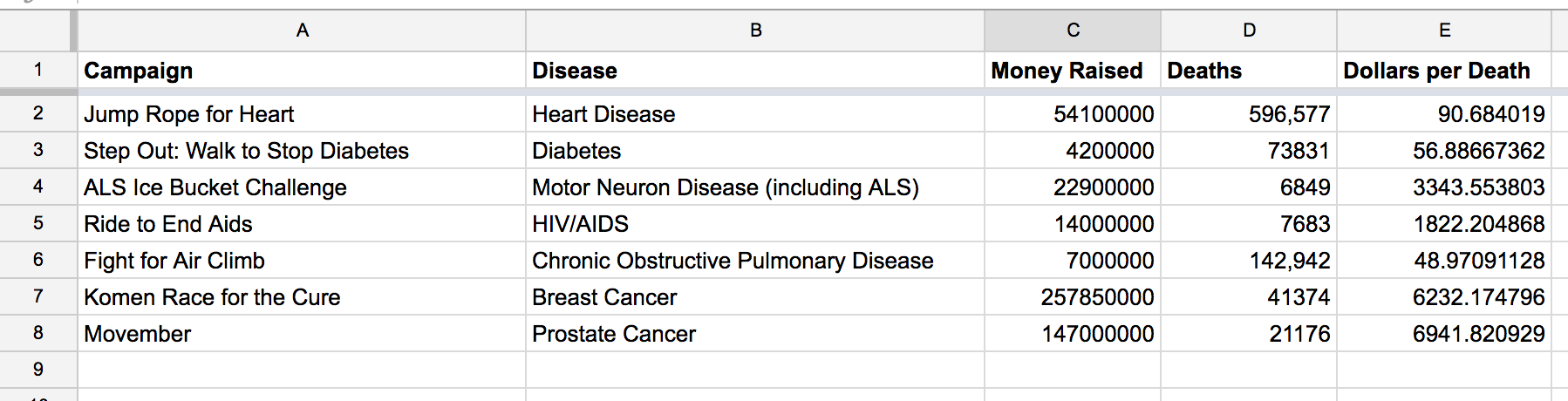
Number of deaths is used as a proxy for seriousness of the disease. – something that seems obvious but is highly debatable.
Let's go with that opinion for now. We can quantify it by creating a column that reflects dollars per death. Assuming column C is money raised, and D is deaths, run this formula in column E:
=C2/D2
Here's a bar chart:
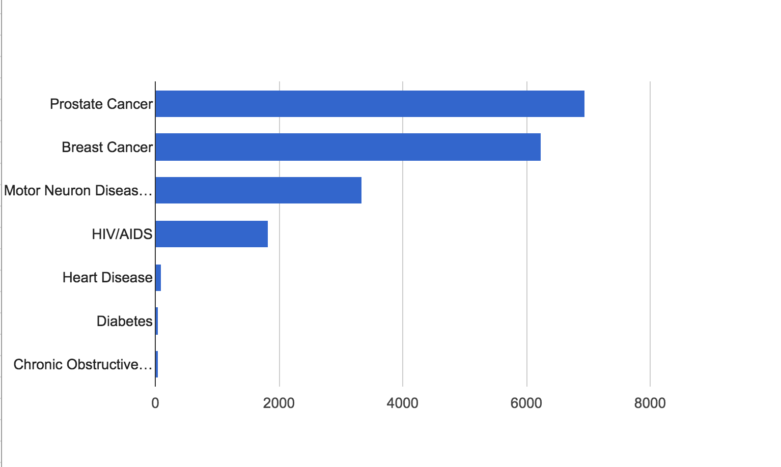
The problem of the bar chart is that it doesn't show the actual deaths per disease. The reader just has to know that prostate and breast cancers aren't all that deadly.
The solution to that problem is to create a scatter plot, with Deaths on one axis, and Dollars per Death on the other:
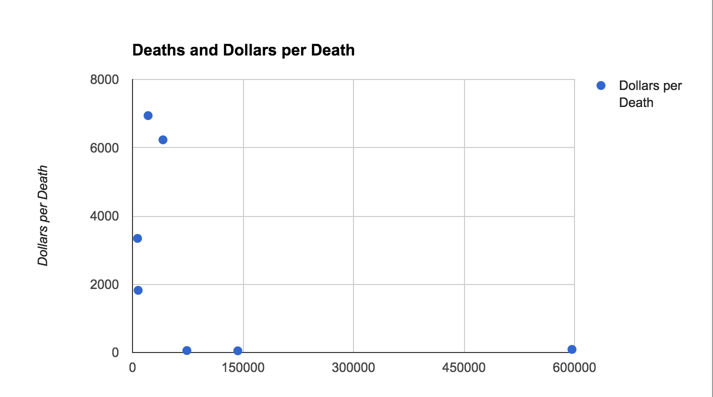
Ostensibly, if the world were a better place, these dots would fall along a line that went from lower-left to upper-right, i.e. the more deaths, the more dollars spent. Instead, it's the inverse, with low-fatality diseases placing high on the dollars-per-death axis.
Data is complex
However, the biggest problem with the Vox visualization is not its visualization technique, but the way it chooses to simplify the issue with data.
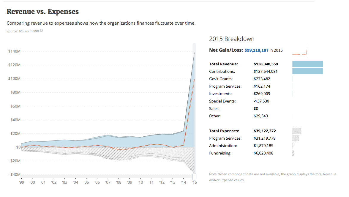
Check out the ALS Association's profile on Guidestar (via Stanford network). Its 2015 revenue vs expenses chart are clearly exceptional, for the ALS:
But let's look at the American Heart Association, which the Vox piece characterizes as having $54M in donations:
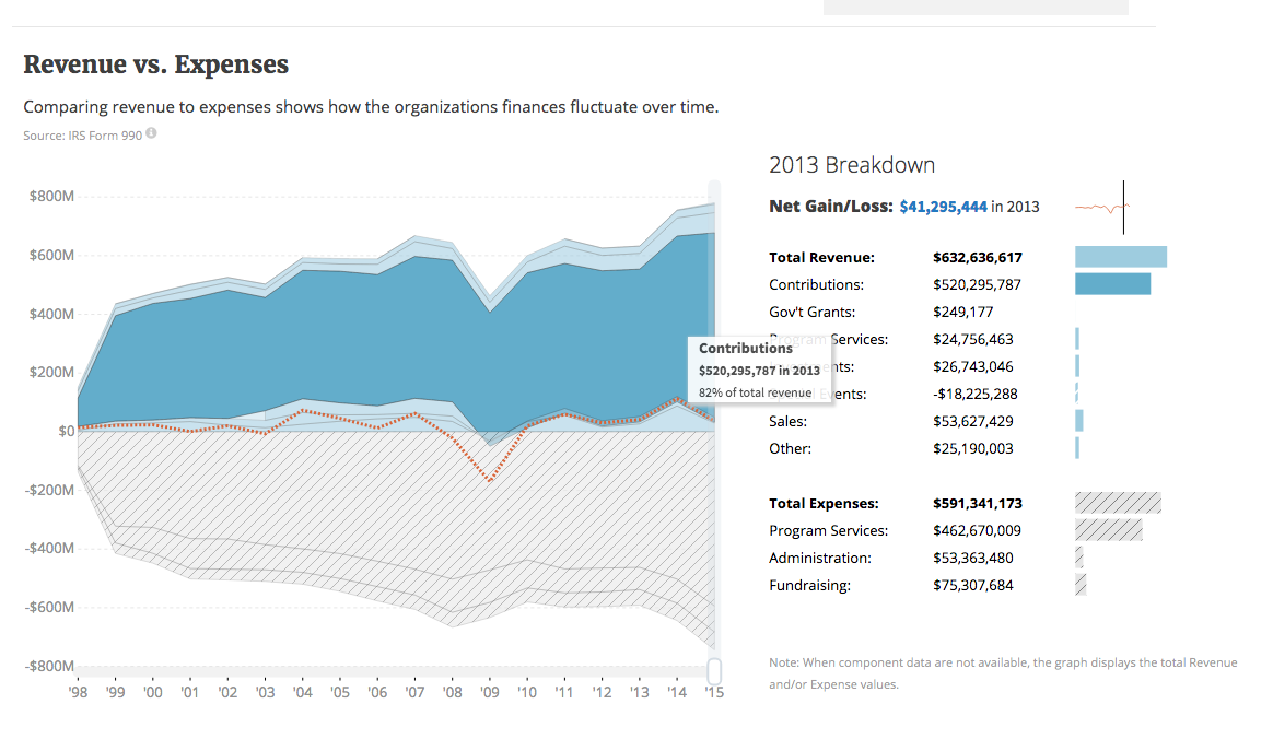
One thing that the chart's difficult legend obscures is the fact that Vox is comparing fundraisers. But while ALS had one massive fundraiser, can we say the same for charities that deal with heart disease, cancer, etc.? In fact, other diseases may have more than one major charity fighting the cause. Whereas with ALS, the ALS Association may be the sole big nonprofit.
Again, the hard problem ends up being research and understanding the scope of the issue. Limiting things to major fundraising campaigns does not get us anywhere near answering the question of whether ALS's outsized Ice Bucket Challenge hurt other charities, or was even particularly unreasonable.